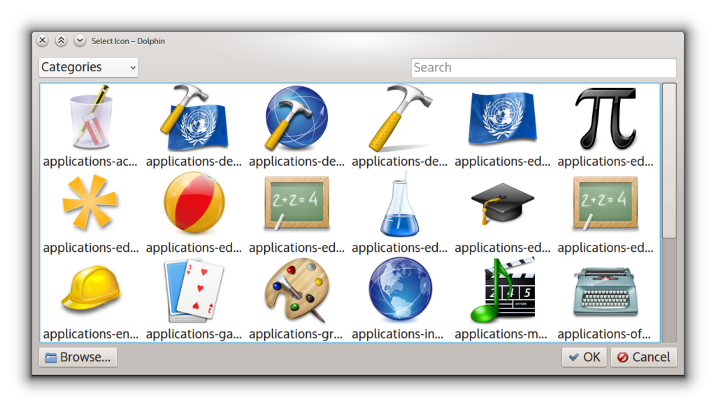
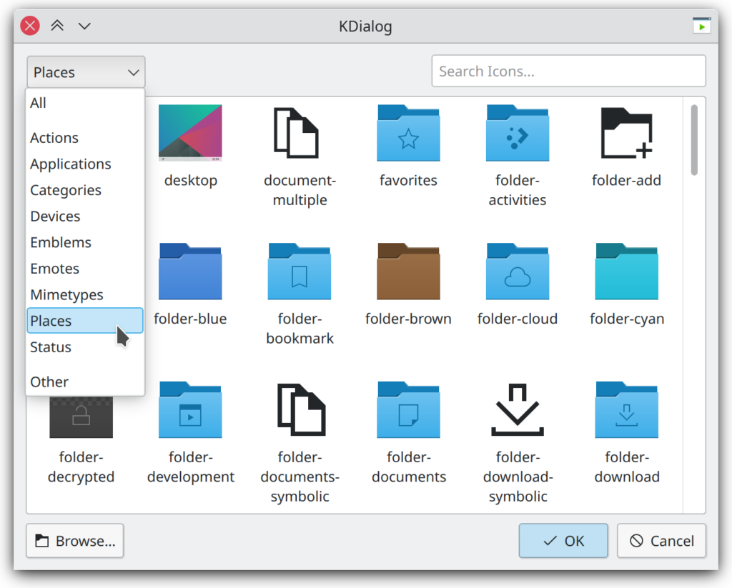
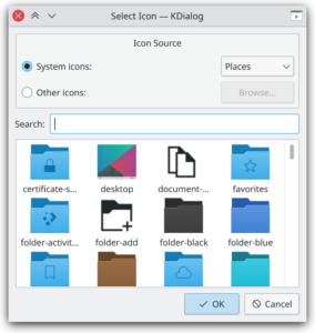
In my 10 year anniversary blog post I mentioned how I wanted to fully redesign the icon chooser dialog which hasn’t changed since its inception and my childhood. Well, guess what I just did between sessions at this year’s Akademy.
I recently added a job creator test application to KJobWidgets so I could test the job tracker in Plasma’s notification center without having to write fake KJob classes all the time. The user interface for it was quickly bodged together in Qt Designer, so the other day I figured, I might as well try to recreate the new icon dialog layout and hook its existing C++ logic to a new UI.
You know you’re up for an exciting task when the files you open have a copyright from 1997 in them. I still love the design I came up with back then so it was re-implemented pretty much exactly the same. While the patch files might still be floating around on some backup hard drive, I am not sure they would have helped much here and thus everything was coded from scratch.

The dialog was programmatically built in C++ which can become quite a mess once you start nesting multiple layouts. With Qt Designer you arrange widgets in a WYSIWYG fashion (which admittedly can also be fiddly at times) and export them to an XML file. At build time this file is then turned into a C++ class which you can plug into your project.
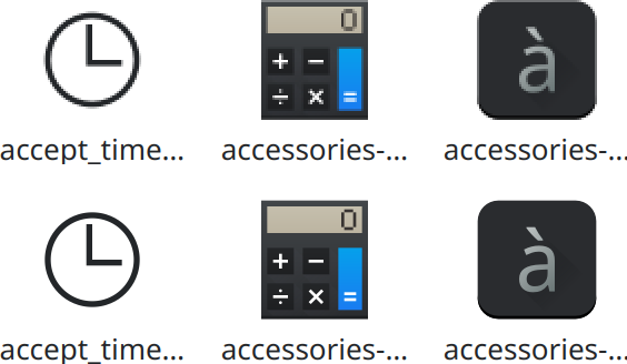
In order to make sure at least something comes out of this effort, even if after all I would lose motivation to redo the entire thing, I put individual bits and pieces on KDE’s GitLab as I went along. For instance, I made a fix for high-dpi scaling as all the icons in the grid view were just scaled up and thus pixelated.
With eight more years of Qt and C++ experience than last time I tried, it took me just a couple of hours over the course of two Akademy evenings to wire up the existing dialog logic to the newly generated UI file. Thanks to a test application in the kiconthemes repository I was also able to test some of the more specialized view modes the dialog offers, such as picking a symbolic toolbar icon, or restricting access to the file dialog for choosing an image from a custom path. Finally, I managed to pull off what I didn’t achieve last time: displaying the icon names in multiple lines.
Of course my inner perfectionist didn’t stop there: I also added a “No icons matching the search” placeholder similar to the one found in Dolphin and other KDE applications nowadays. More importantly, though, the icons are now loaded on demand as you scroll the view. Previously, when in the “All” section for example, the dialog would render and load all 4,000+ icons from Breeze into memory at once, which is why there was this progress bar. With the new back-end the dialog opens almost instantly and most of the time you probably use the search field to find a particular icon anyway. It does take around 300 ms on my computer to initially collect the list of all the icons but that’s still an order of magnitude quicker than before. Besides, a category like “Places” which is opened when picking a folder icon in Dolphin contains only a fraction of the full icon set.


It looks amazing! Congratulations. :)
That sounds excellent. Thanks for your work on this! :)
Do you think an Apply-button would be hard to add to this?
I like seeing the icon where it’ll be used, to see how it looks like there and because it may sometimes switch to the small, monochrome icon.
By doing away with that initial loading time, you’ve actually already made that a lot quicker, but with an Apply-button, one could easily try different icons without losing one’s place in the icon list.
Not sure. The dialog can be used both with a fully event-driven API and a classic message box style function that returns the chosen icon.
Adding an “Apply” button in the former case should be trivial, but the dialog is already dismissed when clicking an icon to select it and I don’t want to jeopardize that majority use case.
Also, typically the icon dialog is spawned by a button on some other config dialog, so typically you wouldn’t see the end result unless you hit “Apply” on that dialog, too.